
Reporting · 7 min read
Reading the dashboard
Every headline figure and panel explained, including how realisation rate and return on cost are worked out.
What it is for
The dashboard is the management-review pack. It is computed live from the register each time you open it, so there is nothing to refresh and no report to run.
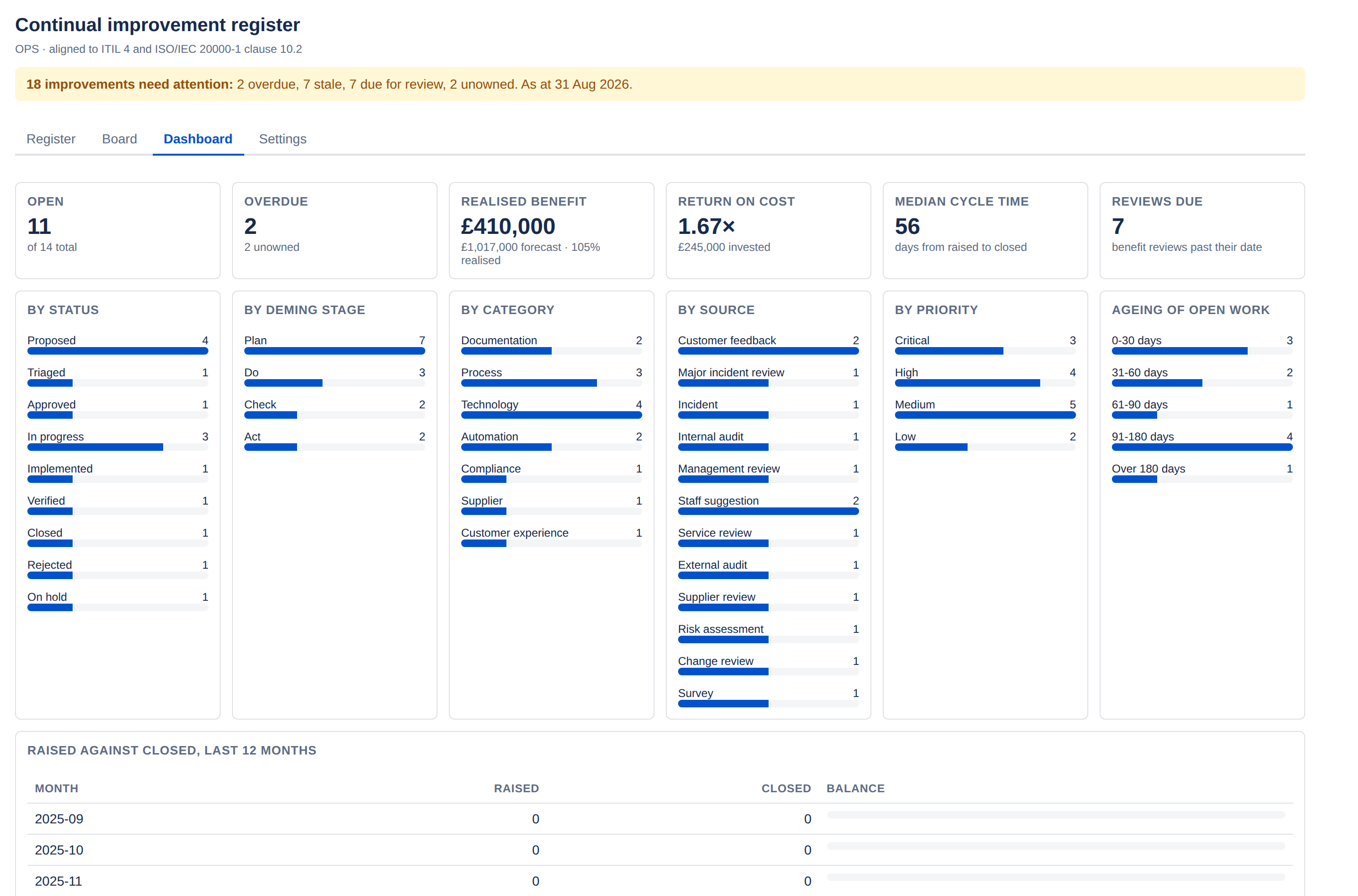
The six headline figures
| Tile | What it counts |
|---|---|
| Open | Improvements at Proposed, Triaged, Approved, In progress, Implemented or On hold. The smaller figure beneath is the total in the register, so "11 of 14" means three are finished or rejected. Note that Verified does not count as open — the work is done and evidenced, it is simply not closed yet. |
| Overdue | Open improvements past their target date. The line beneath reports how many open records have no owner. |
| Realised benefit | Total realised value across verified and closed records only. Beneath it: the realisation rate, and the forecast it is measured against — the forecast of those same verified and closed records, not of the whole register. |
| Return on cost | Realised benefit divided by total cost estimate, with the total invested beneath. |
| Median cycle time | Days from raised to closed, across records that have closed. A median rather than a mean, so one abandoned three-year item does not distort it. Shows a dash until something closes. |
| Reviews due | Improvements whose benefit review date has passed. |
Return on cost reads low early on, and that is honest. The numerator counts only work that has been verified or closed; the denominator counts the cost of everything you have committed to. A programme half way through a large improvement will show a figure below 1×. It rises as work completes.
Realisation rate above 100%
Not an error. It means completed improvements beat their forecasts. The comparison is realised benefit against the forecast of those same verified and closed records, so it is a fair like-for-like — adding an ambitious forecast to new work cannot move it.
The six breakdowns
Each panel counts the register a different way.
- By status — where everything sits in the lifecycle.
- By Deming stage — the same data rolled into Plan, Do, Check and Act. A register heavy in Plan is one that proposes more than it delivers.
- By category — your own configured categories.
- By source — where improvements come from. The panel that answers "how much of this is audit-driven?".
- By priority — Critical through Low.
- Ageing of open work — open improvements bucketed 0–30, 31–60, 61–90, 91–180 and over 180 days since being raised. The right-hand buckets are the interesting ones.
Raised against closed
A twelve-month table of how many improvements were raised and how many closed each month, with a balance bar.
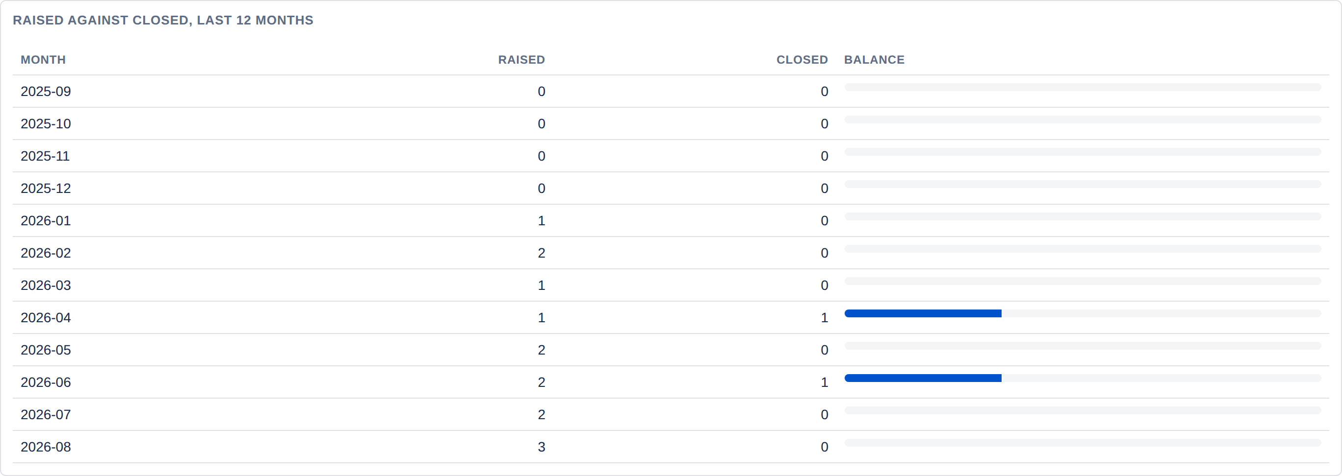
This is the flow question: is the register keeping up with itself? Consistently raising more than you close means the backlog is growing, however healthy the individual records look.
Needs attention
The improvements needing attention, with the reason for each — overdue, stale, due for review or no owner. Like the rest of the dashboard it is worked out when you open it, and it shows the 20 that have been waiting longest. The dashboard gadget and the email digest are built from the same list and use the same words.
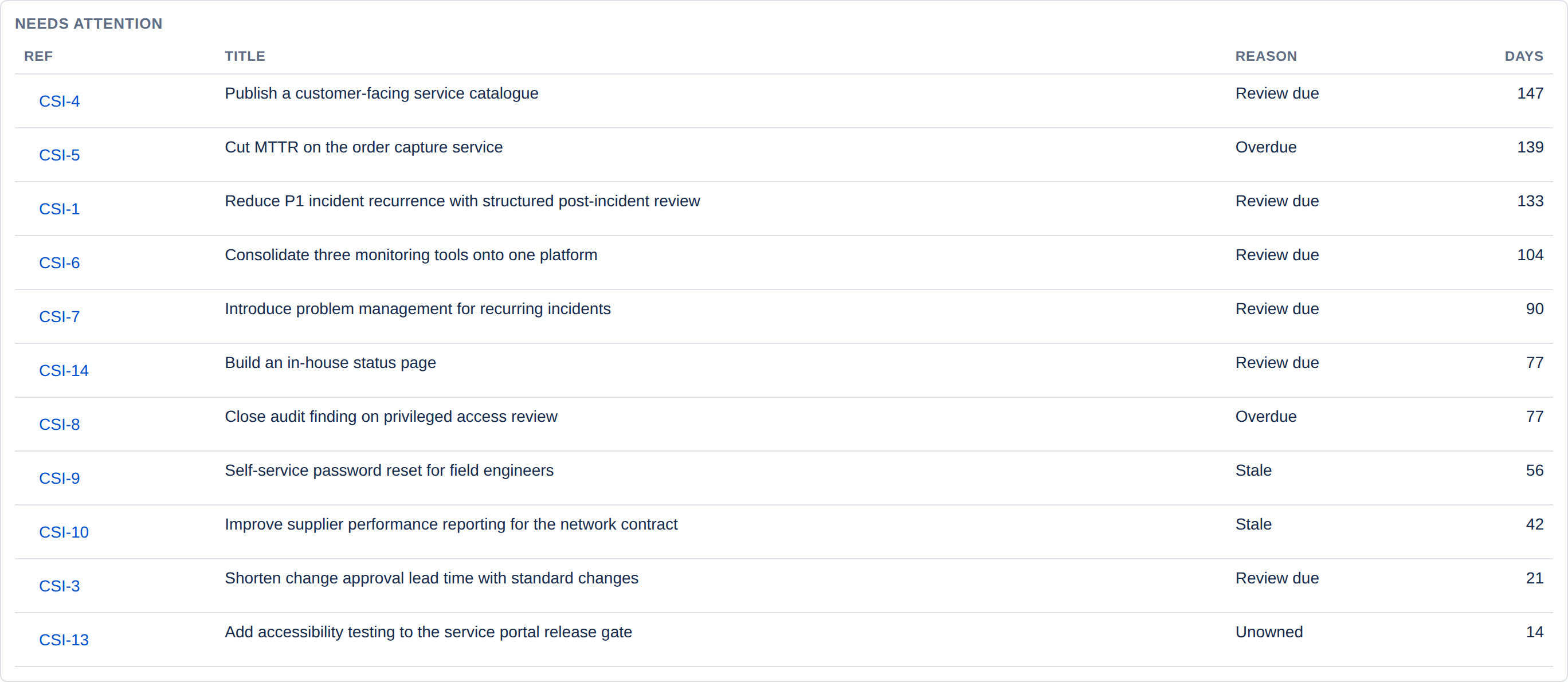
Each record appears once, under the most pressing reason, in this order:
- Overdue — past its target date.
- Due for review — its benefit review date has passed.
- Stale — not updated within the project's stale threshold.
- No owner — open with nobody's name against it.
The Days column means different things for different reasons:
| Reason | Days counts |
|---|---|
| Overdue, No owner | The record's age — days since it was raised. |
| Stale, Due for review | Days since the record was last updated. |
For an overdue item, Days is not how late it is. It counts from when the improvement was raised, not from its target date — so a record raised last week and already overdue shows a small number. The rows are sorted by the Days figure, whichever it means, so read the actual target date on the record itself. The gadget and the email print the unit beside each number — 139 days old, 56 days since update — for exactly this reason.
Trend
A history of open count, overdue count, realised benefit and median cycle time, captured weekly.
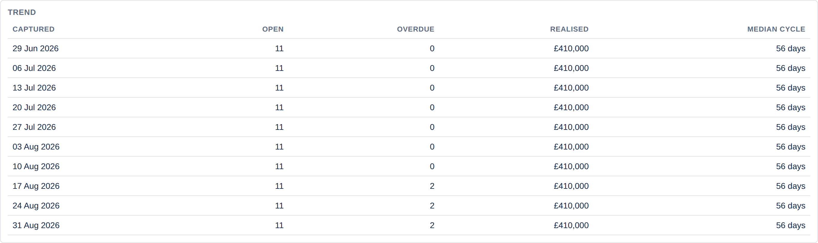
This is the only part of the dashboard that is not computed live — it is written by a job that runs once a week. A brand-new register shows a message rather than a table until that job has run at least twice, which is expected rather than a fault.
Using it in a management review
A workable running order, and roughly what each part answers:
- Open and overdue — is the register under control?
- Needs attention — what specifically needs a decision today?
- Raised against closed — are we keeping pace?
- Realised benefit and return on cost — is this worth doing at all?
- By source — where is the demand coming from, and is that the right mix?
- Trend — are the answers above better or worse than last quarter?
For a record of the discussion, export the register at the same time — see Exporting to CSV.